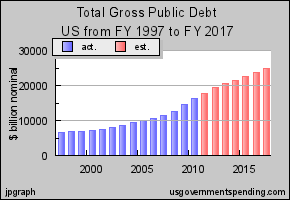
Just two simple charts today. The first is of the projected US government debt. As you’ll see, this week’s sequester (forced $42bn spending cut) makes little difference to the trend – up. up, up, up.
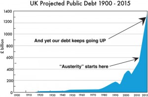
But the US chart looks positively wonderful compared to the UK’s projected debt.

Our problem is that the government hasn’t a clue what to do. They cut a bit of capital spending and thereby reduced useful economic activity. But they haven’t touched wasteful current spending -�bloated salaries and pensions for Britain’s bloated, useless public sector and bloated benefits for the lazy, feckless, workshy and parasitic. I don’t know how this is going to end, but it won’t be pretty. And these figures don’t include the cost of 2 to 3 million Romanians and Bulgarians coming to Britain. I reckon that will be another��30bn a year in housing, education, healthcare, policing and benefits.
A couple of months ago I started moving my savings out of sterling and am waiting for the pound to stage a brief recovery before moving more money abroad.
(click on title to leave a comment)


You can not compare two graphs with different timelines on the X axis (20 years V 115 years) so this article is totally misleading. Also you need to adjust for real value as opposed to nominal value in order to be able to deduce if debt is really increasing or not and if so what the real increase actually is.