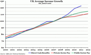
There’s been much heat and noise over the Government’s cap on benefits. And over the coming couple of years, there will be endless public-sector strikes as public-sector unions demand pay rises. So, I thought I’d�reproduce a chart which shows�the trend in�benefits, public-sector wages and private-sector wages over the last 12 years.
As you’ll see, average cash benefits per recipient have risen most in percentage terms since the 2007/8 crash. Next are public-sector salaries, in spite of the Government’s claim to have frozen these and the unions’�posturing they are being brutally squeezed. Lowest wage increases are in the private sector – the sector that has to work to pay for more rapidly increasing benefits and public-sector salaries. Case closed?

