Weekend blog
I have taken the liberty of copying (below) the summary from the latest report on the Earth’s climate from the Global Warming Policy Foundation (GWPF) – The state of the climate in 2021
(If I have breached Copyright, I will happily delete the GWPF summary from this blog)
Here’s the full 54-page report:
https://www.thegwpf.org/content/uploads/2022/04/Humlum-State-of-Climate-2021-.pdf
Facts rather than hysteria
You don’t need to read the GWPF summary below. You shouldn’t find anything you didn’t know already. My reasons for writing this blog are different.
Firstly, I give the GWPF summary as an excellent example of the kind of objective, calm, fact-based analysis we should be getting from our politicians, ‘scientists’, media and truant schoolchildren. But you won’t ever find it. Instead we get hysteria-ridden, hugely-exaggerated claims of climate catastrophe and disaster which are little more than deliberate lies.
Much hotter/colder/wetter/drier than average. Time to panic?
But there’s a deeper problem with climate reporting. You might have noticed that this week was much hotter than average in parts of India, much wetter than average (worst floods in 60 years) in parts of South Africa, much colder than average (in fact there was a new record set) in Winnipeg in Canada, a bit stormy in the Philippines (or maybe it was Indonesia), very windy in Croatia and much drier than average somewhere else (I can’t remember where and can’t be bothered to find out).
Our rulers, the ‘scientists’ and the media use these large variations from the average to bludgeon us into submission to their ever more oppressive supposedly climate-saving restrictions on our lives – higher fuel prices, banning gas central heating, banning petrol cars, new taxes on motorists, new taxes on foreign holidays, fuel rationing, new speed limits etc etc etc.
But this reporting of record hot/cold/wet/dry/stormy spells completely misuses the concept of averages. The whole point of an average is that it is ‘an average’. I know this will come as a surprise to our mathematically- and arithmetically-challenged politicians, grant-hungry supposed ‘scientists’ and posturing, attention-seeking, careerist BBC and C4 News journalists, but you should not expect every hour of every day to be within spitting distance of the average every day of the year for that time of year.
I ain’t no mathematician. But let’s take an example. There are about 195 countries in the world (although Mr Putin is working hard to reduce that number). Let’s assume there are say 20 regions/cities in each of those countries where climate can be reported. That gives 3,900 locations. Then let’s take five main weather possibilities – hot, cold, wet, dry, stormy. That gives 19,500 opportunities for climate catastrophists to find some region/city that is close to a new climate record. But finding one or two or even three new climate records in one week from these potential 19,500 record-setting regions/cities doesn’t mean the Earth’s climate is heading for disaster. After all, if hyperventilating ‘journalists’ even manage to find say 4 records for that week, this still leaves 19,496 regions/cities that are nowhere near new climate records.
I could go on. But given that my readers are much more intelligent and much better-informed than the average person, you probably all got the point long ago – most reporting on climate is complete nonsense.
Though, I’ll just mention one other small but not insignificant point – if a heat-wave, storm, flood or whatever is “the worst for sixty years” or “the worst for decades” or “the worst for the last 100 years”, how come there were terrible heat-waves, storms, floods or whatever so long ago if CO2 is causing them now and yet CO2 levels were much lower decades ago?
No warming – no need to panic
The conclusion of the GWPF report is just what you would expect: – that there has been no significant warming of the air or seas, no significant decrease in ice cover, no significant rise in sea levels, no significant increase in storms ……. In fact, there are no indications at all that we are heading into a climate catastrophe caused by human activity and there is certainly no reason at all why we should impoverish ourselves trying to prevent something which is only happening in the minds of power-hungry politicians, supposed ‘scientists’ who have eagerly leapt onto the lucrative climate-change bandwagon, the progressive, holier-than-thou BBC and the rest of the useless mainstream media.
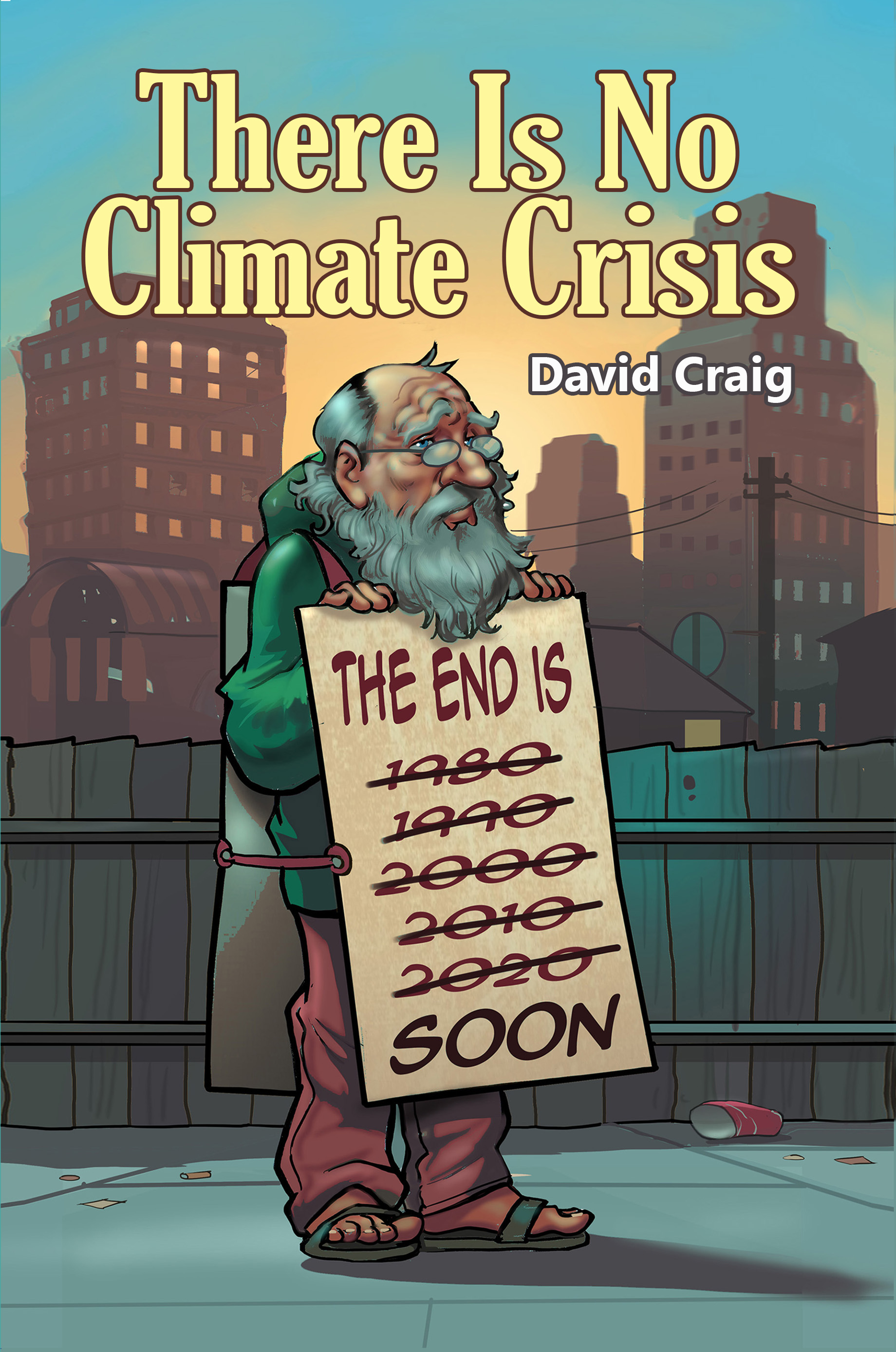
But then, anyone who has read my book THERE IS NO CLIMATE CRISIS or anyone with an IQ even marginally above net zero would know that.
Anyway, for those who are interested, here’s the GWPF’s report’s admirably-researched summary:
General overview 2021
This report has its main focus on observations and not on the output of numerical models.�
Air temperatures
Air temperatures measured near the planet�s surface (surface air temperatures) are at the centre of many climate discussions, but the significance of any short-term warming or cooling should not be overstated. Whenever the Earth experiences warm El Ni�o or cold La Ni�a episodes, major heat exchanges take place between the Pacific Ocean and the atmosphere above, eventually showing up as a signal in the global air temperature. However, such heat exchanges may chiefly reflect redistribution of energy between ocean and atmosphere, and not a change in the heat content of the atmosphere�ocean system. Evaluating the dynamics of ocean temperatures is therefore just as�important as evaluating changes in surface air temperatures.
Considering surface air temperature records since the 19th century, 2021 was a warm year, but cooler than most years since 2016. A moderate La Ni�a episode played out during 2021, underlining the importance of ocean�atmosphere exchanges. Many Arctic regions experienced record high air temperatures in 2016, but since then,�including in 2021, conditions have generally moved toward somewhat cooler conditions. The temperature peak in high northern latitudes in 2016 may have been affected by ocean heat released from the Pacific Ocean during the strong 2015�16 El Ni�o and subsequently transported towards the Arctic region. This underscores how air temperatures may be affected, not only by variations in local conditions, but also by variations playing out in geographically remote regions. Many figures in this report focus on the period since 1979 � the satellite era � when access to a wide range of observations with nearly global coverage, including temperature, became commonplace.
These data provide a detailed view into temperature changes over time at different altitudes in the atmosphere. Among other phenomena, these observations reveal that a Stratospheric temperature plateau has prevailed since 1995. Since 1979, lower Troposphere temperatures have increased over both land and oceans, but most clearly over the land. The most straightforward explanation for this is that much of the warming is caused by solar insolation, but there may be several secondary reasons, such as�changes in cloud cover and land use.
Oceans
The Argo Program, which uses robotic floats to monitor ocean temperatures around the globe, and at different depths, has now achieved 18 years of global coverage, growing from a relatively sparse array of 1000 floats in 2004 to more than 3900 in December 2021. Since 2004, these floats have provided a unique ocean temperature dataset for depths down to 1900m. The data is currently updated to August 2020. Although the oceans are much deeper�than 1900m, and the published Argo data series still is relatively short, interesting features are now emerging from these observations. For example, since 2004, the upper 1900m of the oceans have experienced a globally averaged�net warming of about 0.07�C. The maximum net warming (about 0.2�C) affects the uppermost 100m, mainly near the Equator, where the greatest amount of solar radiation is received.
At greater depths, a small (about 0.025�C) net warming has occurred between 2004 and 2020, according to the Argo floats. Warming is seen across the Equatorial oceans, which, due to the spherical form of the planet, represent a huge surface area. Simultaneously, the northern oceans (55�65�N) have experienced a marked cooling at depths down to 1400m, and slight warming below that. The southern oceans (55�65�S) have warmed slightly at most depths since 2004, but mainly near the surface. However, as discussed later in this report, averages may be misleading, and better insight is often gained by looking at the details.
Sea level
Global sea level is monitored by satellite altimetry and by direct measurement using tide gauges. While the satellite record suggests a global sea-level rise of about 3.3mm per year or more, data from tide gauges all over the world�suggest a stable rise of 1�2mm per year. The tide gauges indicate no recent acceleration (or deceleration) of sea-level rise. The marked difference (a ratio of about 1:2) between the two datasets has no universally accepted explanation, but it is known that the satellite observations face complications in areas near the coast (see, for example, Vignudelli et al. 2019). Whatever the truth, the tide-gauge data are more relevant for local coastal planning purposes.
Sea ice
In 2021, global sea-ice cover remained well below the average for the satellite era, but is now increasing. At the end of 2016, it reached a marked minimum, at least partly caused by the operation of two different natural variation�patterns, affecting sea ice in the Northern and the Southern Hemisphere, respectively. These variations had simultaneous minima in 2016. The trend towards stable or higher ice extent at both poles probably began in 2018, and has since strengthened. The marked Antarctic 2016 sea-ice reduction was the result of unusual wind conditions.
Snow cover
Variations in global snow cover are mainly caused by changes in the Northern Hemisphere, where all the major land areas are located. Southern Hemisphere snow is mainly found in the Antarctic, and cover is therefore relatively stable. The Northern Hemisphere average snow cover has been stable since the onset of satellite observations, although local and regional interannual variations may be large. Since 1979, Northern Hemisphere snow cover in autumn has been slightly increasing, the mid-winter cover is basically stable, and the spring cover is
slightly decreasing. In 2021, the Northern Hemisphere seasonal snow cover was close to the 1972�2020 average.
Storms and hurricanes
The most recent data on global tropical storm and hurricane accumulated cyclone energy (ACE) is well within the range observed since 1970. In fact, the ACE data is highly variable over time, with a significant 3.6-year variation, but without any clear trend towards higher or lower values. A longer series for the Atlantic Basin, however, indicates there may be an oscillation of about 60 years� duration for tropical storm and hurricane ACE. The number of hurricanes making landfall in the continental United States remains within the range for the entire observation period since 1851.


Probably the calculation of an average is the most advanced maths that most people can do and that is why they believe the nonsense from climate scientists. Some refer to maths as the language of physics but it is not just about manipulating numbers it has to give meaning and understanding. An average temperature cannot be calculated because there is no total temperature, unlike total mass for example. Temperatures can only be presented as a distribution with a mean and standard deviation. An average temperature is helpful when we decide about holiday destinations but it isn�t physics. I was pleased to see the GWPF raising issues with all the measurements related to climate change.
I think climate science has now gone beyond physics and has become an unshakable faith for many including politicians. It is impossible to discuss it with them. The result is disastrous energy policies. If it is possible to predict future climate then the required work is not being done. In the last few days I have seen two references to the Little Ice Age giving supporting evidence. Michael Mann�s hockey stick eliminated this from the climate record. The present Holocene epoch might be seen as one of steady warming but the LIA shows this is not the case. Cold is the danger and we need to study what caused the LIA. We also know that there have been cycles of ice ages when ice covered a lot of the northern hemisphere. There is no reason to think that has come to an end and we must put effort into understanding it. We at around the peak of an interglacial stage but we could have a severely cold period followed by a warm period before the next ice age. We can�t do anything to control it but we need to be prepared, although that is probably beyond our capability considering the chaos brought about by a virus.
I tend to monitor climate change by spying on the woman next door.
If for example I peek through the curtains and she is in her garden wearing a cardigan, I think “global cooling”
If she is sporting an umberella I think, “getting wetter”
I have found this system works very well and is far more accurate than the rot spoken by most top scientists worldwide.
You should try this for yourself but for goodness sake don’t let her see that you are watching her.