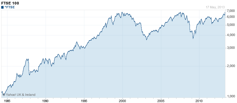
This is a typical chart of how stock markets perform over time. This is the FTSE100 (the largest 100 public companies in Britain).
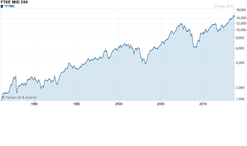
And here is the FTSE250 (the next 250 companies below the FTSE100)
What do you notice? Apart from a few blips, the value of shares goes up and up and up. Yippeee! We can all be rich!
In fact, when the FTSE100 recently reached 6600, many personal finance journalists were blethering on about “record highs” and even predicting the FTSE100 could reach a dizzy all-time record of 7000 by the end of the year.
With many savers getting next to no interest on their bank deposit accounts, hundreds of thousands of normally risk-averse people (often pensioners) have been persuaded by charts like this, by financial advisers�and by personal finance journalists to move their savings from bank and building society accounts paying paltry rates of interest�into shares, usually by putting their cash into unit trusts.
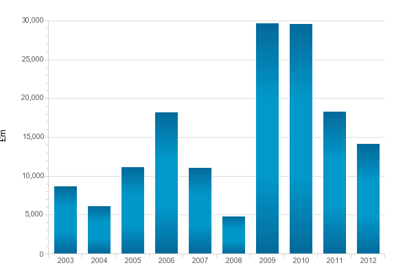
Here are unit trusts sales for the last 10 years:
You’ll notice a leap in the money going into unit trusts when interest rates collapsed in 2008/9�following the financial crisis.
So, what’s the problem? After all, it looks like lots of people have sensibly shifted their savings from banks paying little to no interest to shares which just keep on going up and up and up.
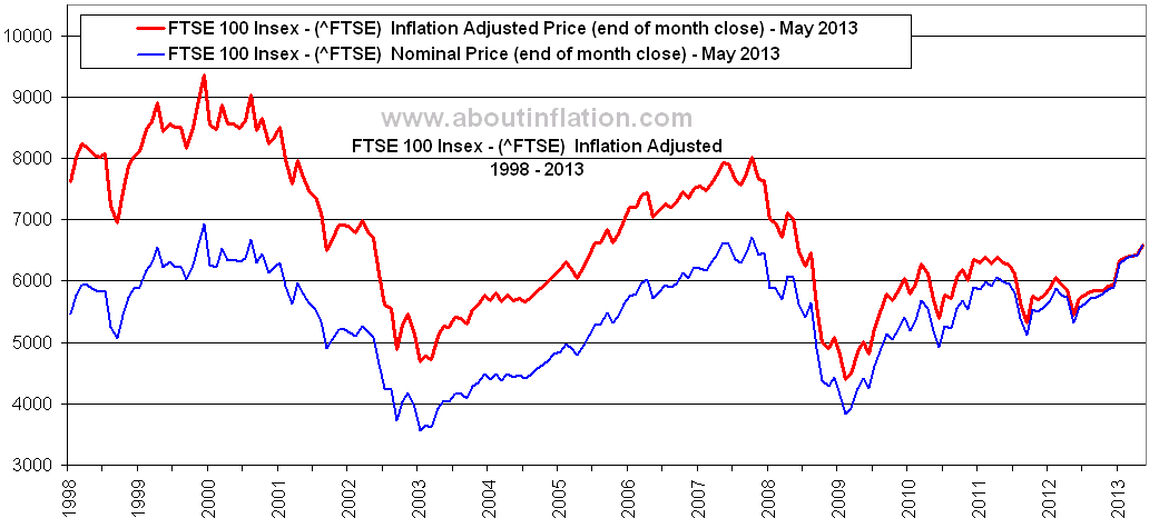
Well, the problem is that once you take inflation into account, shares don’t go up and up and up. In fact, they go down and down and down. The red line on the chart below shows how the real value (after inflation) of shares has crashed since 2000:
The blue line is the “nominal value” of shares – that’s the number that financial advisers and personal finance journalists like to use to convince us that shares are a good bet for our savings.
Looking at the red line,�you’ll see that the FTSE100 is not at “record highs”. In fact, the FTSE100 would have to hit 9000 to get back to the level of 13 years ago – and that’s not going to happen.
In the 6 years from 2003 to 2008 (inclusive), savers put an average of �10bn a year into unit trusts. In the 3 years from 2009 to 2011, this more than doubled to �23bn a year. So, over these 3 years an extra �39bn poured into unit trusts. This extra �39bn will earn around �1.2bn a year for financial advisers, unit trust salespeople and unit trust managers. But it will make ordinary savers an awful lot poorer.
The real advantage of buying shares (rather than having your money in a bank deposit account)�comes from�the dividends paid by the companies whose shares you own. These make up around 80% of the returns you’ll get from owning shares. But if you’re putting money into shares either directly or through a unit trust because you think share values go up and up and up, just remember most of the journalists writing in the Money sections of newspapers know that the value of shares is falling�and they are just lying shysters earning a living by convincing financially-ignorant punters to put their money into the unit trusts that are the biggest advertisers in their newspapers.
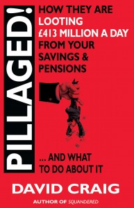
(Of course, if you want to learn more about how to protect your savings and save for your retirement, you could always buy a copy of my book PILLAGED How they’re looting �413m a day from your savings and pensions. Pillaged will cost you about seven quid and save you many thousands of pounds)







Having read your fantastic blog for quite some time, and being 86, death holds no fear for me, because I have come to the conclusion,that, with very few exceptions,
every bastard on this planet is out to screw me.
David – I have bought and read Pillaged and I think it’s a book that anyone interested in protecting themselves from being skinned alive by the finance industry should read.
BUT this post does not help your credibility.
Firstly: the FTSE250 is NOT “the largest 250 public companies in Britain.” It’s the 250 next largest AFTER the largest 100.
Secondly: Did you really think that no-one would notice that you start out talking about the FTSE250 and then drift into talking about the FTSE100 without mentioning that it’s a completely different index which has no overlap whatever with the FTSE250? Doing that makes you look daft at best, dishonest at worst.
If you think a chart of the FTSE100 would look “pretty similar” to the eye-catching chart you start with, why don’t you put one up so that we can judge for ourselves?
Thirdly: What about dividends? If you don’t use a total return graph you are misleading the reader. Dividends are a crucial element of the return from shares.