(Thursday/Friday blog – by David Craig, proud to have been banned from commenting on the Times and Sunday Times websites for political incorrectness about politics, Brexit, BLM, immigration, climate, charities, Third-world corruption and our favouritest religion)
Not so jolly hockey sticks?
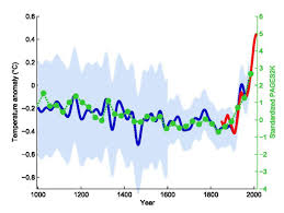
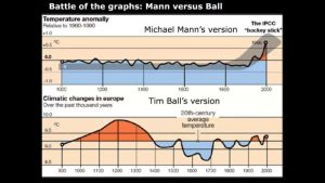
The most famous ‘hockey stick’ graph in history is probably Michael Mann’s chart of global temperatures for the last thousand or so years supposedly ‘proving’ that the Earth was now entering a period of unprecedented warming:
In case there are any educationally-challenged Greta-worshippers reading this, here’s why it was called a “hockey stick graph”:
For the last 20+ years, much of the hysteria about global warming � later re-labeled �climate change� then “climate emergency” then “extinction of mankind” � was based on this so-called �hockey stick� graph produced by Michael Mann. The graph was used by the IPCC, the media and governments to push global warming hysteria to the point of mass mental illness, where supposed ‘experts’ repeatedly claimed for the last 25 years that we only had 10 years or 8 years or whatever remaining before a climate apocalypse would somehow melt all the Arctic ice, flood most of the world’s major cities, kill tens of millions and destroy the planet.
If I remember correctly, a few courageous scientists questioned the mass hysteria and accuracy of Mr Mann’s wondrous hockey stick and they asked him to provide details of the data and algorithm used to produce the chart. If I remember correctly, Mr Mann repeatedly refused.
But other scientists started producing their own temperature graphs. Here’s one going back 2,000 years:
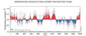
And these graphs seemingly contradicted Mr Mann’s famous hockey stick by suggesting that climate warming similar to that claimed by Mr Mann had occurred several times in the past.
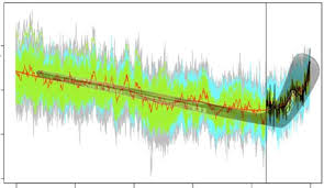
One scientist, Tim Ball (if I remember correctly) even suggested that Mr Mann’s graph was a fraud because it ‘disappeared’ a major period of warming about 1,000 years ago:
There was even a lengthy court case which (I believe) Mr Mann lost in 2019 and was ordered to pay his opponent’s costs.
Of course, the demolishing of Mann’s infamous hockey stick graph did nothing to diminish the fanaticism of the Man-Made Global Warming loonies. If anything, it drove them to even more extreme predictions of impending climate disaster. Numerous climate conferences with 20,00 or more delegates flying in from all over the world were held to discuss the supposed problem and two of Britain’s most famous climatologists – Prince Charles ‘the adulterer’ Windsor and Prince Harry of Hollywood – bravely took private jets to several of these conferences to warn us plebs to travel less.
Witless Whitty and his hockey stick
But the Mann hockey stick farce did at least achieve one thing – it taught scientists, supposed ‘scientists’ and other ‘experts’ of their ilk that if you want to terrify the public witless, a hockey stick chart is a wonderful way to do it. Hence we had Monday’s performance by Britain’s Laurel and Hardy – a socially-distanced Professor Chris Whitty and Sir Patrick Valance;

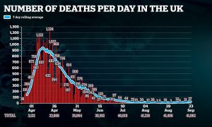
And they too, produced an impressive hockey-stick chart of their own postulating that UK Wuhan flu infections could soon reach over 49,000 a day :
Aaaarrrgghhhh! We’ re all going to die.
There are, however a few questions to be asked about the Whitty/Valance projections.
For example, one might wonder why their projections are so far in excess of anything that is happening in France or Spain:
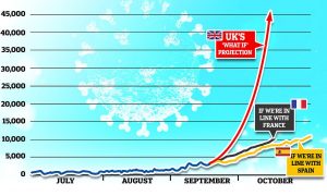
(left-click on graph once then left-click again to see it more clearly)
Moreover, the data was presented in such a way as to suggest that the UK could soon be back to the infection levels seen at the height of Xi Pingpong’s Chinese plague in March and April:
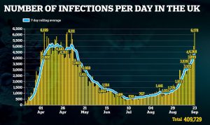
But, in using charts like this to frighten us into obedient submission, the ‘experts’ seem to ‘forget’ that in March and April, the only people being tested were those going to hospital. Now many more people – NHS workers, care-home workers, anyone with a slight headache or cold and umpteen other groups of people are trooping up to have their tests.
For example, a member of my family who works in a care home is being tested once to twice a week. There will be a similar testing regime in most of the UK’s 21,000+ care homes. So, we actually have no idea what infection levels were in March and April as people who just had mild symptoms wouldn’t have been tested:
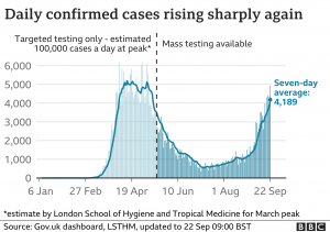
Actual infection levels in March and April may well have been five or ten or even twenty times (100,000 cases a day at the peak?) those shown on the two charts above. If so, then we are nowhere near the March/April up to 100,000 cases a day infection levels nor are we ever likely to be. That’s something our rulers don’t mention.
Thus it’s scientifically illiterate, or even fraudulent, to compare the number of Chinese plague cases in March and April, when there was minimal testing, to the number being identified now we’re moving into mass testing.
Moreover, as I’ve previously tried to explain – if 200,000 tests are conducted in one day and there are 4,000 positives, then with a ‘false positives’ rate of just 1%, 1,960 (almost half) of the supposed ‘positives’ will actually be ‘false positives’. If the ‘false positives’ rate is 1.5% then 2,940 (around 75%) of the supposed ‘positives’ will be ‘false positives’.
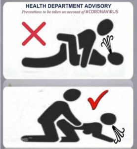
Stay safe – use the doggy position?
I suppose infections are rising. Though this hasn’t yet resulted in (and may not ever result in) rising death rates:
After all, the death rates closely follow infection rates in March and April. But we don’t see the same linkage with the August/September rise in infections.
I suspect the ‘experts’ are deliberately using the most extreme interpretations of the figures and the most dramatic graphs to browbeat us all into sheep-like obedience.
As for me, I’m going to follow the Government’s advice (see below). I’m sure my latest wife will understand I’m only doing this as part of my societal duty to protect her from Chairman for Life Xi Pingpong’s Chinese plague:
Some sanity from Tony Heller?
I wonder what the inimitable and ever incisive Tony Heller thinks about the credibility of Britain’s leading supposed ‘scientists’:


Another great, incisive post – well done David
Regarding the woman in the diagram, you should just tell her to hold her breath until you’re done.
It works for me and watching my partner first turn blue and then collapse is considered part of our foreplay.
Professor Chris Whitty seems to have accumulated a tremendous amount of power and influence during his career in medicine.
The son of a diplomat who was murdered by Religion of Peace terrorists in Greece in 1984, he appears to possess no fewer than eight different degrees, not just in medicine but also in medical law, economics, and business administration.
In the recent past, he has somehow managed to hold down as many as four major jobs in the medical profession at the same time. He has history with Professor Neil ‘Pantsdown’ Ferguson, the scientist who predicted half a million UK deaths from C-19, and Whitty has been a major player as a government apparatchik since 2009.
One wonders what his current motivation is. We know that Whitty was Professor of Public and International Health at the London School of Hygiene & Tropical Medicine at the time when it was the recipient of Bill Gates’ largesse to the tune of $40 million ( I enjoyed a recent online comment that for $40 Million you’re not giving a donation, you’re making a purchase), but this was only one of Whitty’s gigs back then.
Is he another Cummings, an un-elected advisor who has become unbalanced by the power awarded to him in the effective power vacuum of Johnson’s shambolic ‘Conservative’ government? Is he an obsessed ‘wonk’, a specialist with a theory which he has finally been allowed to put to the test, regardless of the consequences to the public? Or does the Gates connection offer a clue?
he would be a prime case for some serious investigative journalism – f only there were some serious investigative journalists around nowadays.
The common link between the hockey sticks is abuse of statistics. I believe the Mann court case required him to release details of his work, which he has not done. The result of the hockey stick climate curve was that they then needed physics to explain it and the consequence of that was a load of pseudo-science that does not agree with the known laws of physics and this is being taught in schools and universities.
In the case of Covid19 we have been presented with daily death numbers and the implication that Covid19 was the only cause. The numbers are the raw data that go into the statistics and we will not have the correct view of the death statistics until the virus dies away. We are being mislead in both cases, and in the case of Covid19 we are being told about cases, using a testing system that some experts say is not fit for purpose, but the implication is that these people are infectious and the test tells us nothing about that.
For governments and scientist to lie to the population and get away with it needs a population educated into imbecility.
One does not even have to be any more than an average educated mathematician to see through the blatant manipulation of data ,its presentation and false analysis.It tells us much about the dumbing down of educational standards,that so many just accept this rubbish.In addition,so many are frightened to question or challenge those in authority,which I find somewhat ironic in these so called ‘enlightened’ times.
I noticed the alarm and dread over in the USA as the Covid death toll was about to reach 200,000. This in a country with a population of 330 million! We here in Britain must have been a very stoic and exceptional race of people back in 1918-19. By 1919, Spanish Flu had killed 228,000 of our fit and healthy young folk, (unlike Covid that kills off the elderly and already sick) and we just carried on as best we could. One also had to bear in mind that we had also lost 750,000 of our brightest and best during 14-18 fighting a war we had no real reason to get involved with in the first place. Additionally at that time were governing the biggest Empire in history in territorial size. 20 years later we had recovered sufficiently that we felt capable of declaring war on the Nazis. Now we face economic ruin over the death of a mere 42,000, most of whom had one foot in the grave to begin with. I came across this forecast of doom and gloom by a certain Egon von Greyerz: �The Dark Years will be extremely severe for most countries both financially and socially. In many countries in the Western world there will be a severe depression and it will be the end of the welfare state. Most private and state pension schemes are also likely to collapse. It will be a worldwide depression but some countries may only have a deep recession. There will be famine, homelessness and misery resulting in social as well as political unrest. Different type of government leaders and regimes are likely to result from this.�
Think he flogs gold so he�s bound to exaggerate, but with the central banks printing trillions in currency representing no actual value, how long before we reach a Zimbabwe like situation?
Here is an excellent no-holds-barred video on Covid and other related matters. Boris is called a bare-faced liar with explanations supplied.
�Who is Pulling the Strings of this Puppet, Boris Johnson?�
David, you seem to be setting a precedent for being banned. Tony Heller has effectively been banned from YouTube, and is moving to NewTube. Principia Scientific has been banned from Linkedin.