(Tuesday blog)
Not so jolly hockey stick
I’m running late to day, but will still have a go at writing a blog.
You’ll all know about Michael Mann’s infamous hockey-stick chart that has been used and used by the ecofascists to try to impose their new form of globalist socialist control over us:
This chart has been so discredited that one journalist even wrote a book about Mann and his hockey-stick chart called “A Disgrace to the Profession“. The book also questions Mann’s claim that he is a Nobel Prizewinner.
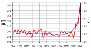
Cooler heads believe that the chart below gives a more accurate representation of climate changes since the last Ice Age:
This chart suggests that we are moving out of the Little Ice Age into the Modern Warm period and that the current warming is nothing exceptional compared to previous warming.
CO2 is great – give us more!
But Michael Mann and the ecofascists are not the only people who can produce charts. Here’s one you might like. On the x-axis (that’s the horizontal one for dim, scientifically-challenged snowflakes like Saint Greta the Grim Reaper) the chart tracks the level of CO2 rising from about 260 parts per million (ppm) towards 400 ppm. On the y-axis (the vertical one, Greta) it tracks human life expectancy:
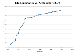
Oh look, the more CO2 there is in the atmosphere, the higher is human life expectancy. Life expectancy goes up from about 40 years to over 70 years. See, the chart proves this.
Or here’s another one.�On the x-axis the chart again tracks the level of CO2 rising from about 260 ppm towards 400 ppm. On the y-axis (the vertical one) it tracks global deaths from natural disasters:
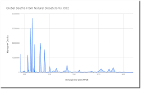
Good heavens, the chart proves that the higher the level of CO2 in the atmosphere, the fewer deaths there are from natural disasters. That’s exactly the opposite of what is claimed by Saint Greta and the ecofascists.
OK, I was just messing around with the above two charts. Of course, there’s a huge difference between correlation and causation. And the two charts above merely show correlation. But you wouldn’t know that listening to foam-flecked misuse of data by the crazed Greenies. In fact, the ecofascists’ charts of a link between rising temperatures and rising CO2 levels are correct. But not in the way the ecofascists claim. The causation is the opposite of the ecofascists’ cult. What actually is happening is that a natural cyclical warming of the Earth is causing more CO2 to be released by the oceans into the atmosphere and NOT increasing CO2 causing rising temperatures. But as I hopefully show in the above two charts, you can easily twist a simple correlation into a supposed causation.
So, let’s move to a chart with real causation. This one looks at crop yields increasing as CO2 levels rise thus providing ever more food for the Earth’s rapidly increasing population:
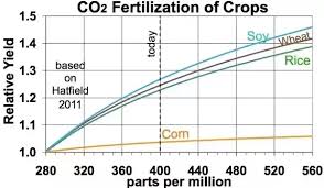
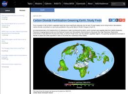
Not only have crop yields increased, but they are projected to increase further. In fact, you hardly ever hear of anyone dying from starvation any more and a NASA study showed that increasing CO2 levels are causing a ‘greening’ of the Earth:
Moreover, commercial greenhouse operators pump in CO2 into their greenhouses to (I think) about 1,000 ppm to improve crop yields.
But Mad Greta and her brainwashed, can’t-think-for-themselves, scientifically-illiterate disciples believe that CO2 is some kind of poisonous gas that will kill us all.
What about the ‘Cambrian Period’?
It’s believed that during the Cambrian Period, CO2 levels were around 7,000 ppm. That’s rather higher than the 400 ppm that is causing Saint Greta the Ignorant and her followers to wet their collective knickers in mass panic:
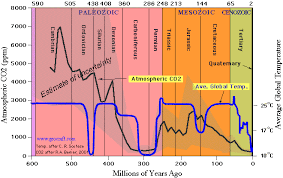
And what do we know about the Cambrian Period?�The�Cambrian Period, part of the Paleozoic�Era, produced the most intense burst of evolution ever known. The�Cambrian�Explosion saw an incredible diversity of�life�emerge, including many major animal groups alive today.
Why not go back to school in Sweden, Greta you idiot, and learn some basic science before you start howling and screaming about your ‘lost childhood’ and about impending climate catastrophe?
It’s all bollucks.


Even when running late you have produced something new with some of these graphs. The life expectancy and deaths from natural disasters show a correlation with CO2 but that does not mean that CO2 is causing these changes. This is precisely what Al Gore claimed when he showed ice core data which he claimed showed that increasing CO2 causes temperature to increased. A new scientific theory that Brian Cox also supports along with consensus, except when he needed millions of taxpayer funding to carry out experiments to discover the Higgs Boson particle.
The Hockey stick curve should also remind us of one of Tony Heller�s videos. The sharp rise in temperature is described as a tipping point when disastrous rises in temperature started because of our activity that we have to stop because it is out of control. He points out that CO2 was about 300 ppm then, so if the warmists science is correct we have to get CO2 back to that level. Even Greta and Michael Mann haven�t worked that out and they doesn�t know how to get CO2 out of the atmosphere.
Thanks for the comment. I have now updated the blog to highlight the difference between charts showing ‘correlation’ and those showing ‘causation’. As you say, the Greeny ecofascists often use ‘correlation’ charts to suggest ‘causation’.
To follow up the above, I have just read that a court case is due to start in the USA against Exxon claiming they misled investors about the risks of climate change. Science is about to be determined by lawyers rather than by scientists.
Excellent blog yet again. At a guess I’d say that only a tiny proportion of the general population understand the difference between “correlation” and “causation”, the former frequently being easy to find in support of even the most bizarre situations, the latter being rather more difficult actually to prove scientifically and demonstrate statistically. It’s simple – although deplorable in view of how much is spent on education in the West – to see how a generation who need a calculator to subtract 10p. from �1 can be so easily bamboozled. It is deplorable, though, that certain scientists who have a large following amongst the young should evidently be so willing effectively to abuse their high public profiles by not taking issue with false or contrived data.
I’ve just seen on online article about beautiful places destroyed by weather, such as glaciers and rock arches on the coast – all create by weather in the first place. The stupidity of articles on this issue is getting worse, and people will believe them without question.
I know you like videos. Here is one I found from 11 years ago. Al Gore’s Travelin’ Global Warming Show